
Many years ago we revealed to our clients a new disability access font aimed at helping folk with dyslexia [see: ‘dyslexiefont‘ September 2015]. Now there’s another method to help struggling readers and it’s called ‘Bionic Reading‘.
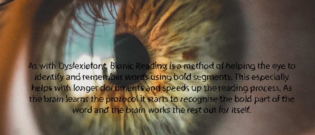
As with Dyslexiefont, Bionic Reading is a method of helping the eye to identify and remember words using bold segments. This especially helps with longer documents, speeding up the reading process. As the brain learns the protocol your brain starts to recognise the bold part of the word and works the rest out for itself.
For example, the last paragraph above would visual look like this using the Bionic Reading method:
As with Dyslexiefont, Bionic Reading is a method of helping the eye to identify and remember words using bold segments. This especially helps with longer documents, speeding up the reading process. As the brain learns the protocol your brain starts to recognise the bold part of the word and works the rest out for itself.
There’s a Google Chrome browser extension available if you wanted to give it a go, or go to the Bionic Reading website and use the text converter: bionic-reading.com
Also try the speed reading test in the video below.
Another top tip from a graphic designer
If you use a lot of text for advertising, user manuals, web pages etc, you need to hold the attention of the potential new customer so always use lower case characters for the main copy. The reasoning behind this is the eye tracks the top of each word so lower case ascenders (t, h, k etc) are important in the eye-to-brain conversion process.
Try it yourself
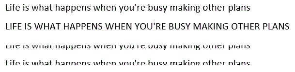
Using the samples below, the top line is a common san serif (without serifs) font using lower case text. The following line is UPPER case. Try reading the 2 quickly, you will notice the UPPER case sample is a little bit slower/harder to read.
Line 3 has the top half of the text line removed, not easy to read, however removing the bottom half doesn’t restrict the legibility thus proving the eye tracks the top of the word not all the word.
sampled text use (quote: John Lennon)
There are many other ‘tricks’ us graphic designers use to make text stand out especially in classified sections of news/magazine print where the competition are all fighting for your business.
If you regularly pay for ad space contact us for a free consultation on how to max your marketing budget and get the phone ringing
 Previous Post
 Next Post