Dyslexia is a big problem for many of us and as a person who has (not suffers) dyslexia sometimes life can be challenging. Personally I’ve found using desktop design programs and word processors like MS Word have made a massive difference to my life and my ability to communicate.
Had I sent you a letter before the digital era you may have thought one of my kids had contacted you!
So when I stumbled across this new font my eyes lit up. A font that helps dyslexic people read. I’m aware that glasses with colour filters can help although I’ve not used them. I’m also aware thanks to my art school training, that ascenders and descenders in fonts also help (the eye tracks the top of a line of text not the body of the text). But a bespoke font that everyone can use? Brilliant
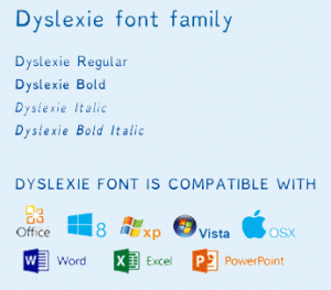
The inventor Christian Boer has decided that to help people with this problem and home use downloads are free – simply go to his website www.dyslexiefont.com
The designer says…“Traditional fonts are designed solely from an aesthetic point of view, which means they often have characteristics that make characters difficult to recognize for people with dyslexia. Oftentimes, the letters of a word are confused, turned around or jumbled up because they look too similar.”
Dyslexie uses…
◾heavy base lines
◾alternating stick and tail lengths
◾larger openings
◾semicursive slants
…to ensure that each character has a unique form.
Unfortunately this font cannot be used on websites (or emails). I won’t go into the reason in this article but see an earlier blog to read why this is an issue, but PDFs can hold the font integrity and they can be used in emails and on web pages….for the printed page this font could be a major breakthrough especially in the education and special needs sectors.
You will be very surprised by the number of successful business leaders who are dyslexic. But don’t be surprised by the way they manage and solve reading problem – and remember, dyslexia rules KO!


